More about the book
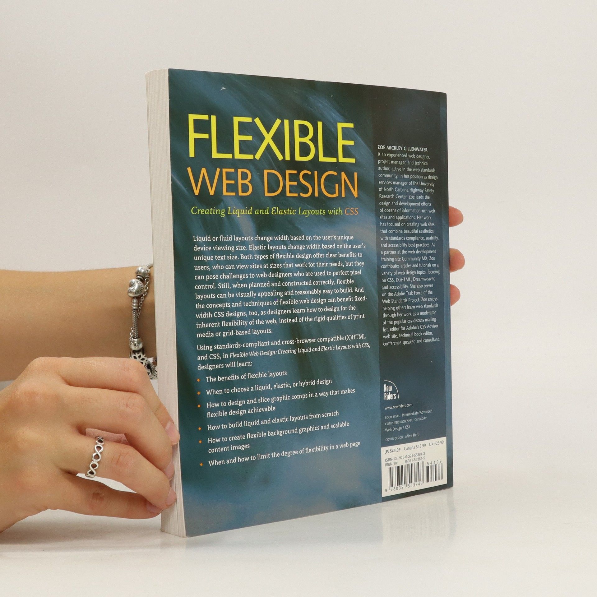
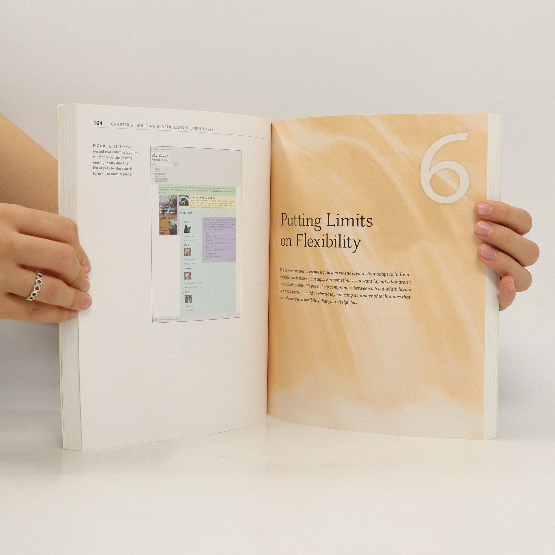
Liquid or fluid layouts change width based on the user's unique device viewing size. These types of layouts have always been possible with tables but offer new design challenges as well as opportunities when built with CSS. This book, for experienced Web designers with some CSS experience, outlines how to do this successfully. Designers will learn the benefits of flexible layouts and when to choose a liquid, elastic, or hybrid design. They will learn not only how to build a liquid layout from scratch using standards-compliant and cross-browser compatible (X)HTML and CSS, but will also learn how to design and slice their graphic comps in a way that makes flexible design achievable. This book will show designers that flexible layouts do not have to be visually boring or difficult to build when planned and built correctly. Even those who do not intend to build liquid layouts can use the concepts and techniques taught in this book to improve their fixed-width CSS designs, because they will learn how to design for the inherent flexibility of the web medium, instead of the rigid qualities of print media or table grid-based layouts.
Book purchase
Flexible Web Design, Zoe Mickley Gillenwater
- Language
- Released
- 2009
- product-detail.submit-box.info.binding
- (Paperback)
Payment methods
We’re missing your review here.


